[NEW] Multi-Currency Addon: Calculate Affiliate Commissions from Any Currency
Eliminate calculation errors, ensure fair payouts and simplify management of your international affiliate program.
Continue Reading →Join 30,000+ Smart Business Owners who use AffiliateWP to Grow Their Revenue, FASTER!
Eliminate calculation errors, ensure fair payouts and simplify management of your international affiliate program.
Continue Reading →When it comes to your affiliate program’s success, you want to empower your affiliates – and one of the best ways to do that is with a quality affiliate landing page.
A truly effective affiliate landing page will expand your reach, generate leads, and boost your conversion rate. Not only that; landing pages bridge the gap between the site visitor and the sale, creating an emotional connection – and sparking the feeling of desire. But what is it exactly that creates this effect? And what really works when it comes to bringing in the sales?
In this post, we discuss some tips for creating affiliate landing pages that convert.
Affiliate landing pages exist in the first place to inspire action; your goal is to get your site visitors to click, enter their email, purchase, or otherwise act in some way. It’s important to remember this when designing your landing pages because it will help you make the right decisions.
For example, it can be tempting to make design decisions based purely on aesthetics or your personal taste. While this can be satisfying from a creative perspective, your goal with affiliate landing pages is to make more money, so you want to be thinking predominantly in terms of conversion. Of course, this isn’t to say that you can’t operate within your own stylistic guidelines!
Let’s be honest: affiliate links can spark suspicion in the minds of increasingly tech savvy consumers. Simply hovering over an affiliate link makes it easy to see where it’s going, and long URLs with random characters can be especially off-putting to some people.
Affiliate landing pages bypass this issue altogether, with URLs that are as short and sweet as you want them to be – even customized for the affiliate – making the whole process seem a little more transparent and secure to the customer.
With all of the scams, data breaches, and cyber threats that exist today, potential customers are more wary of anything unusual, so why not employ more straightforward and legitimate methods? Customers appreciate it!
By definition, a landing page is essentially a one-page website – a stand-alone web page or post that customers land on when they go to a certain URL, click a link, etc. In general, landing pages are often part of an advertising campaign or marketing effort that is designed to bring in more site visitors, leads, and sales – and they act as a sales-booster, informing and persuading the customer in a targeted manner.
When it comes to affiliates, landing pages provide a personalized experience for the affiliate’s customers, who (usually) arrive at the page by going to the affiliate’s custom URL (via link or recommendation). Affiliate landing pages not only make it easier and more enjoyable for the customer to interact with your brand; they also foster customer confidence by ensuring that any purchases made are clearly supporting the affiliate.
Now, let’s take a look at the elements that make up the anatomy of an affiliate landing page.
Creating a landing page can be done several ways. If you do your own code, design, and content management, you may prefer to create your landing pages yourself. Plugins like Affiliate Landing Pages allow you to assign any post or page to a specific affiliate. If you’re just starting out and you don’t know any HTML or CSS, tools like Instapage or Thrive can help you create landing pages without having the technical background.
In terms of overall design, clean and contemporary wins every time. Nobody wants to go to a page that looks like it’s straight out of the 90s, unless you’re going for pure nostalgia!
Using plenty of white space is also effective. When visitors arrive at your landing page, it should be easy for them to focus in on the most important information. Too much cluttered content, walls of text, or a disorganized aesthetic can make people abandon the page.
Remember, you want to drive the customers gaze toward what you want them to see. If they have to do a lot of searching, straining, or squinting to find out the gist of the offer, they’re likely to lose interest. Keeping the most important information “above the fold” helps customers understand your offer as quickly as possible, and a minimal approach to the page design helps to minimize distractions.
The headline is your big opportunity to grab the reader’s attention. This is where you need to inspire potential customers to want to read the body of your landing page – and ultimately buy your product!
Don’t be afraid to brainstorm different options for your headline; you can narrow it down to the best ones later. It might take some time to come up with something that sounds really good.
Your headline might compare your product to your competitors’, or feature a customer testimonial. You could highlight a standout feature, or describe a major lifestyle benefit that your product provides. Maybe you want to customize your headlines for specific segments of your affiliate base, or create themed headlines for different holidays, special events, etc.
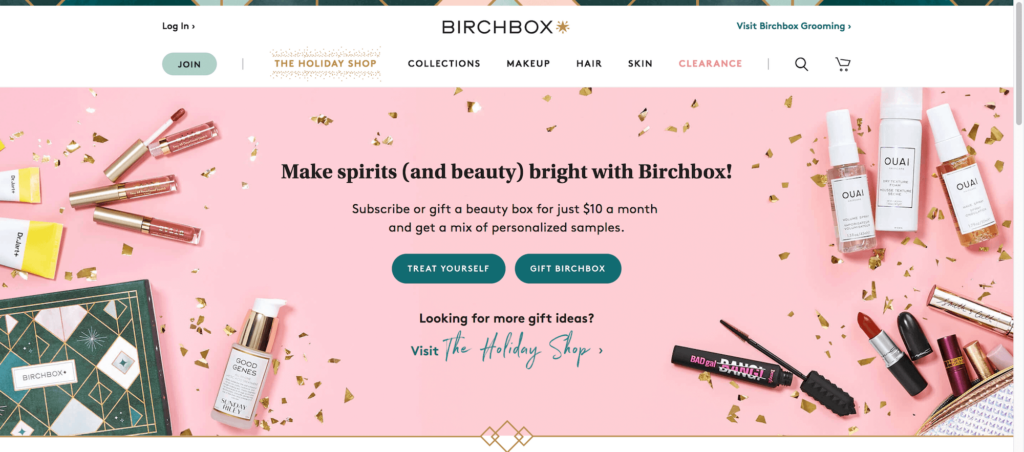
Whether it’s a photo, a banner, or some other graphic, your visual imagery should be front and center. In fact, your image can be the most important thing on your landing page, with the potential to communicate everything at once. Imagery can be powerful. If your product is very visually-oriented, take advantage of this!
Here are some examples of headlines with images to inspire you:
Casual headline with a featured image (Nomad List)
Concise headline with a featured graphic (Hootsuite)
Holiday-themed headline with a background image (Birchbox)
When writing your body text, or the copy of your landing page, your goal is to get the visitor to keep reading. Copy can make or break or break the experience; it must be concise and compelling. It must communicate the key points of the offer, and the real-life benefits of your product. Most of all, the first sentence must make the reader want to continue on!
Consider incorporating storytelling into your copy. Everyone loves a good story, especially if it’s a success story, or one about overcoming relatable obstacles. Asking questions from the beginning and adding an element of mystery can be especially effective, sparking curiosity in the reader and creating the desire for a conclusion (often referred to as an open loop).
Here are a few other tips for writing landing page copy:
Another thing to consider when writing copy is that you want your value proposition to be clear and upfront. Customers need to know why they should buy from you; after all, there’s a lot of competition out there!
Focus on communicating the benefits (the real-world results) that customers will experience using your product, or highlighting standout features that give your products a competitive edge against competitors. The bottom line is that you want to remove any doubt that your product solves the customer’s problem.
Depending on the length of your affiliate landing page, your call to action may appear multiple times, from the top of your the page, to within the body copy itself, to the end of the page. This allows for people who make the purchase decision at different points, giving them easy access no matter where they are on the page.
Additionally, since mobile devices account for a large portion of eCommerce sales, a call-to-action that is “above the fold” means that visitors see it as soon as they land on the page. Even on sites with infinite scroll, this trick still commands their attention right away.
However, modern best practices indicate that creating one single place to click is more effective – and this is especially true for short landing pages that don’t require any scrolling at all.
Regardless, the color of your CTA button should be something that contrasts with your page colors – a color that sticks out and is extremely easy to identify amongst the page content. You’ll also want to decide on the copy for your CTA button.
Consider these common choices:
Nothing sells a product like social proof! This can be in the form of testimonials, reviews from verified purchases, real-world use case examples, total customer count, and social media presence. It’s been proven that photos of real people improve conversion, so consider including customer headshots alongside a testimonial, especially when it comes to high-profile customers!
Here are a few template ideas you could expand upon:
Don’t forget that video is huge these days. If certain affiliates have a large presence on platforms like YouTube, you could embed a video of them promoting your product on their landing page. Sometimes a video alone is enough!
If you already have whiteboard explainer videos, animations, or other promotional video content, consider using it. If you produce videos regularly, you could also create a video to use specifically for your affiliate landing pages – or even incorporate video testimonials.
Customer confidence is worth mentioning because it’s ultimately what makes a sale. It’s what’s behind the customer’s purchase decision, and you simply can’t do without it. So how do you create it?
The answer is through a combination of factors, such as industry authority, business legitimacy, site security, social proof, accurate advertising, and effective marketing. Customers want to buy from people they either a) know, or b) trust – ideally both!
Of course, this is partially achieved through affiliate landing pages in general, because the affiliate has already established trust and familiarity with their customers. But you can be extra sure by increasing your visibility to the customer, and communicating your own industry expertise.
Including payment gateway logos and trust badges / seals is also important because they serve as visual trust cues. Customers want a secure browsing and purchase experience – and you want their confidence!
With any landing page, split testing (or A/B testing) is absolutely essential. How are you going to know what’s working and what’s not, if you don’t have any data to compare?
Creating landing pages that convert is more than just guesswork – you’ve got to do some research. But you don’t necessarily need to go to extreme measures; simply making small changes to things like your headline, images, copy, and call-to-action can produce big results.
For example, if you’re having a hard time deciding on the color of your CTA button, try two different colors on two different landing pages and see which one performs better. It may take time to refine your landing pages to the point where they are as effective as you want them to be. That’s totally okay!
At the end of the day, there are only so many industry-standard practices when it comes to affiliate landing pages. So, take cues from successful companies to get your ideas flowing – there’s no harm in emulating! And remember, some experimentation will always be required to find the perfect mix of elements that will get those conversions happening!
What strategies have you used in your own affiliate landing pages? Did we miss anything? Let us know in the comments below!
Disclosure: Our content is reader-supported. This means if you click on some of our links, then we may earn a commission. We only recommend products that we believe will add value to our readers.
Thank you so much for sharing the valuable tips with me. It’s kind of you if you can let me know a plugin or the best way to do split testing?
I would recommend Google Optimize: https://optimize.google.com/optimize/home/
This helped me alot really a great article
How can i make and design a landing page for my affiliate offer..?
Great post Mandy. What are the specifics of creating a design to your affiliate landing page? Example: if your affiliate product has a black background website with blue text what are the rules to creating a landing page in a similar style?