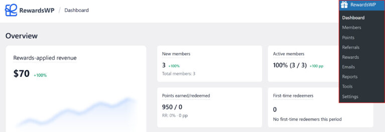
The RewardsWP dashboard gives you a snapshot of how your rewards program is performing. It surfaces key metrics like revenue, member growth, and redemption activity, along with charts, insights, and a live activity feed so you can spot trends and make informed decisions without digging through individual records.
Accessing the dashboard
The dashboard is the first screen you see when you open RewardsWP. To get there, click RewardsWP in your WordPress admin sidebar. Only site administrators can access the RewardsWP dashboard and its settings.
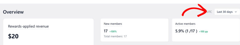
In the top-right corner of the dashboard, you’ll see a date range picker (defaulting to Last 30 days) and your store’s timezone indicator (for example, “UTC”). The date range you select here controls the time window for all KPI cards on the page. Available options are Last 7 days, Last 14 days, Last 30 days, Last 60 days, and Last 90 days.
KPI cards
The top of the dashboard displays a grid of key performance indicator (KPI) cards. Each card shows a primary number, a trend indicator comparing the current period to the previous one, and supporting details.
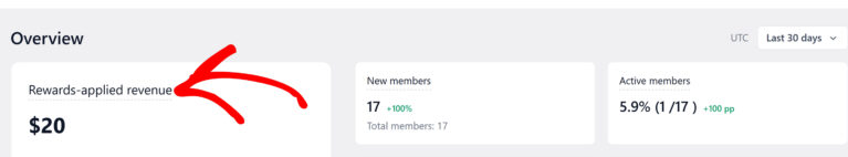
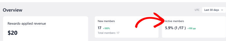
Rewards-applied revenue
This is the largest card on the dashboard. It shows the net sales from orders where a customer used a RewardsWP incentive, such as a points-based discount or a referral reward. The number excludes tax and shipping, and subtracts any refunds.
This card includes a sparkline chart that visualizes revenue over the last 12 weeks, giving you a visual trend line at a glance. Next to the sparkline, a percentage delta shows how the current period compares to the previous one (for example, a green “+15%” or a red “-8%”).
When there isn’t enough data yet (fewer than 5 orders using rewards), the card displays a “Not enough data yet” message with a note: “When more orders use rewards, this chart will show the revenue they drive.”
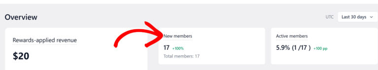
New members
This card tracks how many new members joined your rewards program during the current period. Below the count, a subline shows the total number of members across your entire program (for example, “Total members: 17”), giving you context for the growth number. A percentage delta next to the count compares enrollment to the previous period.
Active members
This card shows the percentage and count of members who earned or redeemed at least once during the current period (for example, “5.9% (1 / 17)”). It includes a delta measured in percentage points (pp) comparing engagement to the previous period, and its own health badge.
Points earned/redeemed
This card tracks the total points earned and redeemed during the current period, displayed as a ratio (for example, “50 / 0”). Below the values, the redemption rate (RR) shows what percentage of earned points were redeemed, along with a percentage-point delta. A healthy redemption rate means members find your rewards valuable and are coming back to use them.
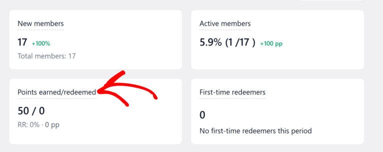
When the points program is disabled, this card shows a “Program off” badge with a link to enable points.
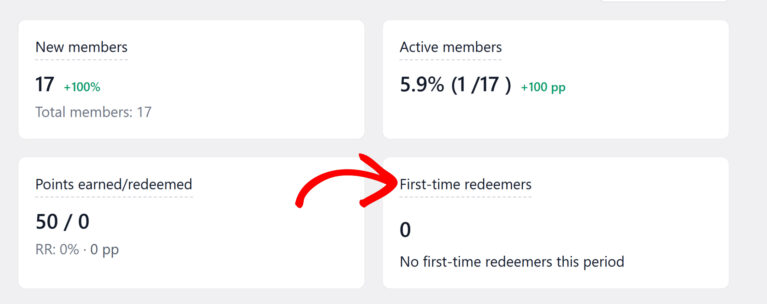
First-time redeemers
This card shows how many members redeemed a reward for the very first time during the current period. It measures how many people are reaching the “first reward” milestone. When there’s no activity, it displays “No first-time redeemers this period.”
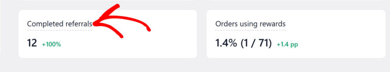
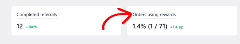
Completed referrals
This card shows the number of referrals that moved to a completed status during the current period. When there’s no activity, it displays “No completed referrals yet” with a note: “When referred friends purchase, they’ll appear here.”
When the referral program is disabled, this card shows a “Program off” badge with a link to enable referrals.
Orders using rewards
This card shows the percentage of orders that used a RewardsWP incentive at checkout. A higher share means rewards are influencing more of your sales. When there’s no activity, it displays “No orders used rewards this period.”
Health badges
Several KPI cards include a health badge that provides a quick assessment of how that metric is performing. Each badge uses the same three-level system but applies different thresholds depending on the metric:
| Badge | What it means |
|---|---|
| Healthy | The metric is performing well. No action needed. |
| Okay | Performance is moderate. There may be room to optimize. |
| Attention | The metric needs review. Consider adjusting your program configuration. |
For the Rewards-applied revenue card, the badge evaluates the ratio between the revenue your program generates and the discounts it gives away. The Active members badge is based on the percentage of engaged members. The Points earned/redeemed badge tracks the redemption rate.
The badges update automatically as your data changes.
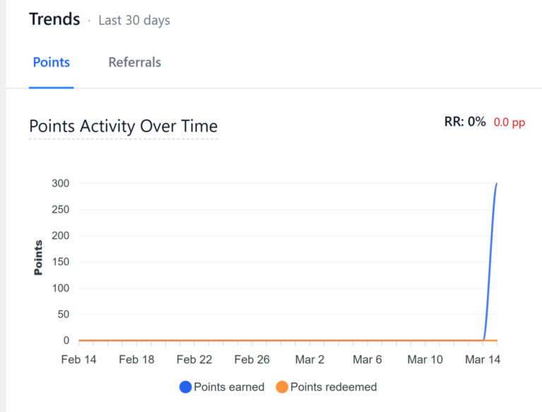
Trends
Below the KPI cards on the left side of the dashboard, the Trends section shows a larger chart with two tabs:
- Points — Displays a “Points Activity Over Time” chart that plots points earned and points redeemed as separate data series over the selected date range. This chart gives you a visual picture of how earning and redeeming activity flows over time. The chart header also shows the overall redemption rate (RR) and its period-over-period delta.
- Referrals — Displays referral activity trends over the same period.
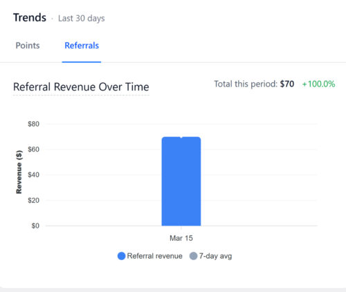
The Trends section uses the same date range as the KPI cards (shown in the section header, for example “Last 30 days”).
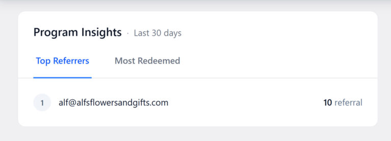
Program Insights
Below the Trends chart, the Program Insights section highlights your top performers with two tabs:
- Top Referrers — Shows the members who have driven the most successful referrals. When there’s no referral activity yet, it displays “No top referrers yet” with a note: “Once members start referring others, your top performers will show here.”
- Most Redeemed — Shows which rewards are being redeemed most frequently, helping you understand which incentives resonate with your members.
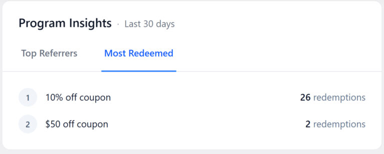
This section helps you identify your most valuable advocates and your most popular rewards at a glance.
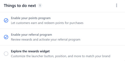
Things to do next
When you first install RewardsWP, the dashboard displays a Things to do next checklist on the right side to help you get your program up and running. The checklist includes tasks such as:
- Enable your points program — Let customers earn and redeem points for purchases.
- Enable your referral program — Review rewards and activate your referral program.
- Explore the rewards widget — Customize the launcher button, position, and more to match your brand.
Each task links directly to the relevant settings page. Completed tasks show a green checkmark. The counter next to the heading (for example, “1”) shows how many tasks remain. Once you’ve completed all tasks or dismissed the checklist, it won’t appear again.
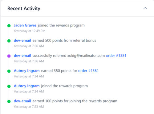
Recent Activity
On the right side of the dashboard, the Recent Activity feed shows a chronological stream of member actions. Each entry includes a colored status dot, the member’s name (linked to their profile), a description of what happened, and a timestamp.
Typical entries include:
- A member joined the rewards program
- A member earned points for a specific order (with a link to the order)
- A member redeemed points for a reward (showing the reward name and points spent)
The feed gives you a quick pulse on day-to-day program activity without navigating to individual member profiles or separate report pages.
Frequently asked questions
How is rewards-applied revenue calculated?
Rewards-applied revenue is the net sales total from orders where a customer used a RewardsWP incentive. It starts with the order total, excludes tax and shipping, and subtracts any refunds. Only orders that involved a RewardsWP discount or referral reward are counted.
How often do the dashboard metrics update?
Metrics update in real time as orders are placed, points are earned, and referrals are tracked. When you load or refresh the dashboard, you’ll see the latest data.
Can I change the time period for the dashboard?
Yes. The date range picker in the top-right corner of the dashboard offers preset options: Last 7 days, Last 14 days, Last 30 days, Last 60 days, and Last 90 days. The default view shows the last 30 days. Changing the range updates all KPI cards and the Trends charts.